Quick share
Maybe you have noticed lately that we are making lots of feature changes to our product but this is all down to our customer's continued feedback.
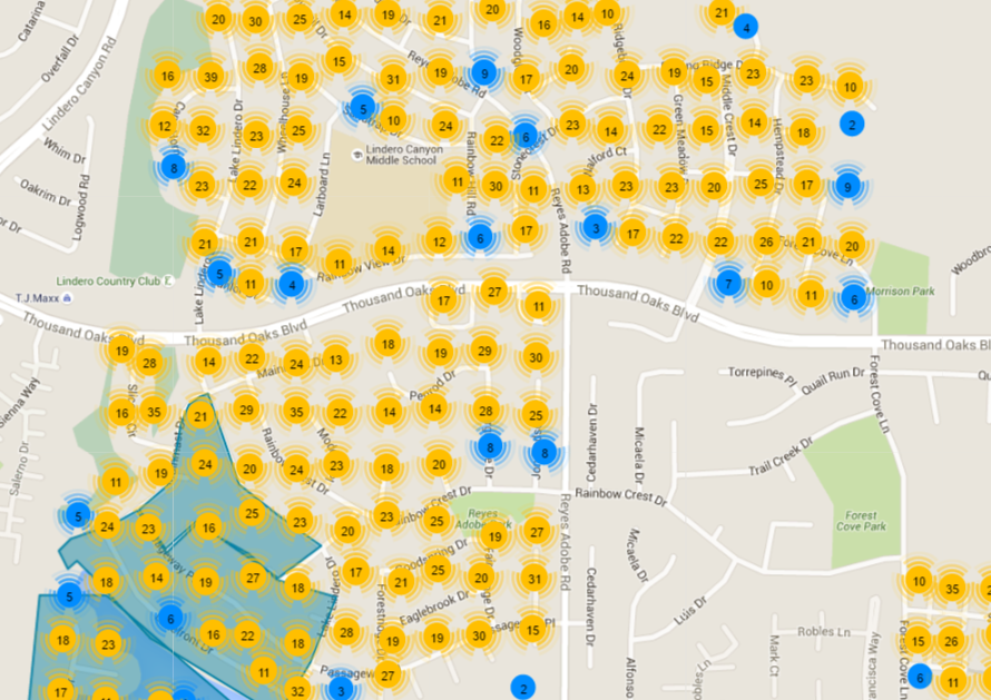
Our Map page is one of the most important parts of our software and this is why we are delighted to say we have improved it for even better functionality.
New and Improved Map Update
Based on customer feedback we are happy to release our upgraded Map page. It is designed to be closer in style to the app for continuity purposes.
Zoomed Out
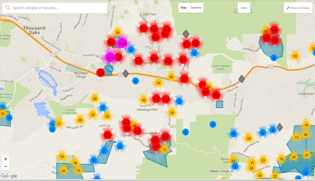
- Pins are now clustered and counted when you are zoomed out. Clusters are different colors based on the size of the cluster, for example, Red for 100’s, Pink for 1000’s.
- You can now view your map in Satellite view.
- You can now click the View button to filter out Houses, Groups or Clusters.
- As all Turfs are effectively Groups like you can create on the People page, we have changed the terminology on the Map page to reflect that. Hence, in the top right, you can now Create a Group, meaning, you can cut a Turf.
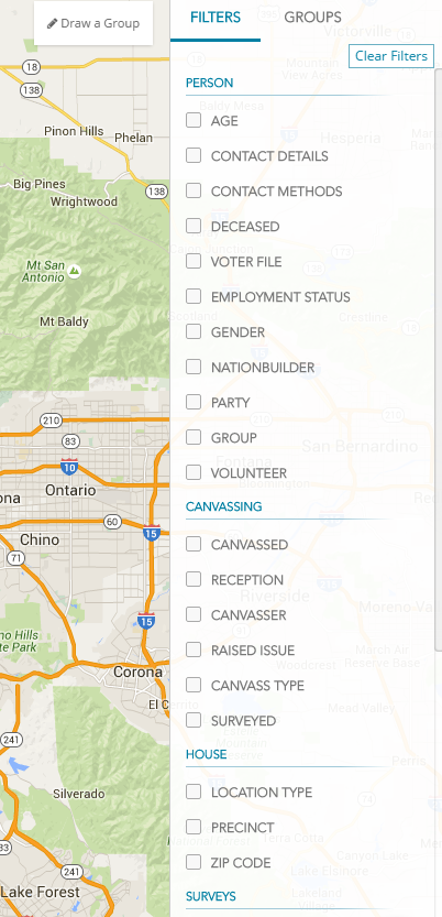
- The right-hand navigation allows you to view Filters or Groups.
- The Filters tab allow you to just show certain segments on the Map page and you can Clear Filters at any time.
- The Groups tab allows you to view a specific turf’s analytics, zero in on the turf by clicking the target icon, or edit the turf.
Zoomed In
- As you zoom into your map you will see your pins separate out. If they remain grouped together they will stay circular and blue (1-10 houses) or yellow (the 10's).
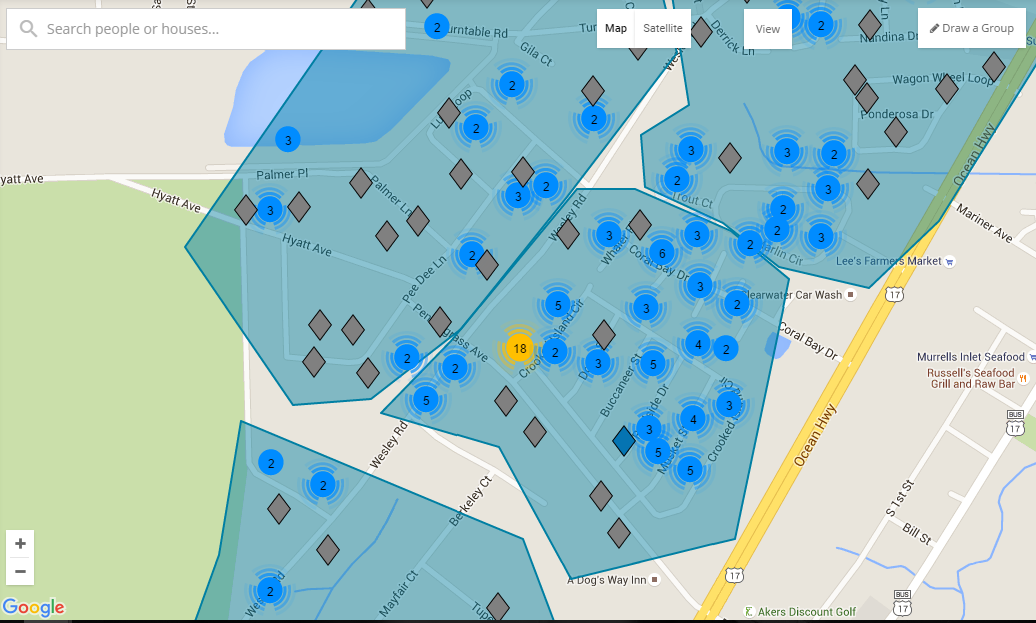
- When a pin is fully separated from other pins it will change to the diamond shape.
- In the circumstance that the pin does not separate, take for example the blue pin above marked with 2, this merely means that two houses have been geolocated onto the same place by Google Maps.
- The diamonds are color-coded to make it easier to understand them on the Map.
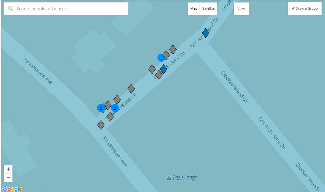
What do the diamond colours mean?
Green - Canvassed
Red - Not Interested
Blue - Not Home, Not Accessible, Call Back
Grey - Not yet Canvassed


.svg)


.svg)
.svg)